law
on
keyes
rosebank, johannesburg


We
were approached to design a new office for a rapidly growing law practice. Given the sensitive nature of the work, both
client and staff required a nurturing environment and so started a journey that
challenged assumptions of what corporate and commercial architecture should be.
Our design sought to re-script the idea of ‘office’ – to transform a traditional, formal, masculine law office into a space that is uplifting, inspiring and humane. The building is designed with the users at the centre of our focus. Instead of designing a beautiful envelope with generic floor plates into which people are arranged to fit, we crafted spaces to suit and fit the people.
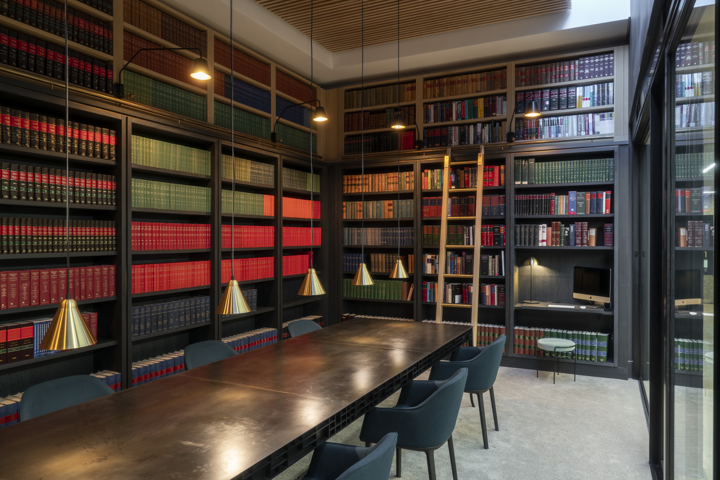
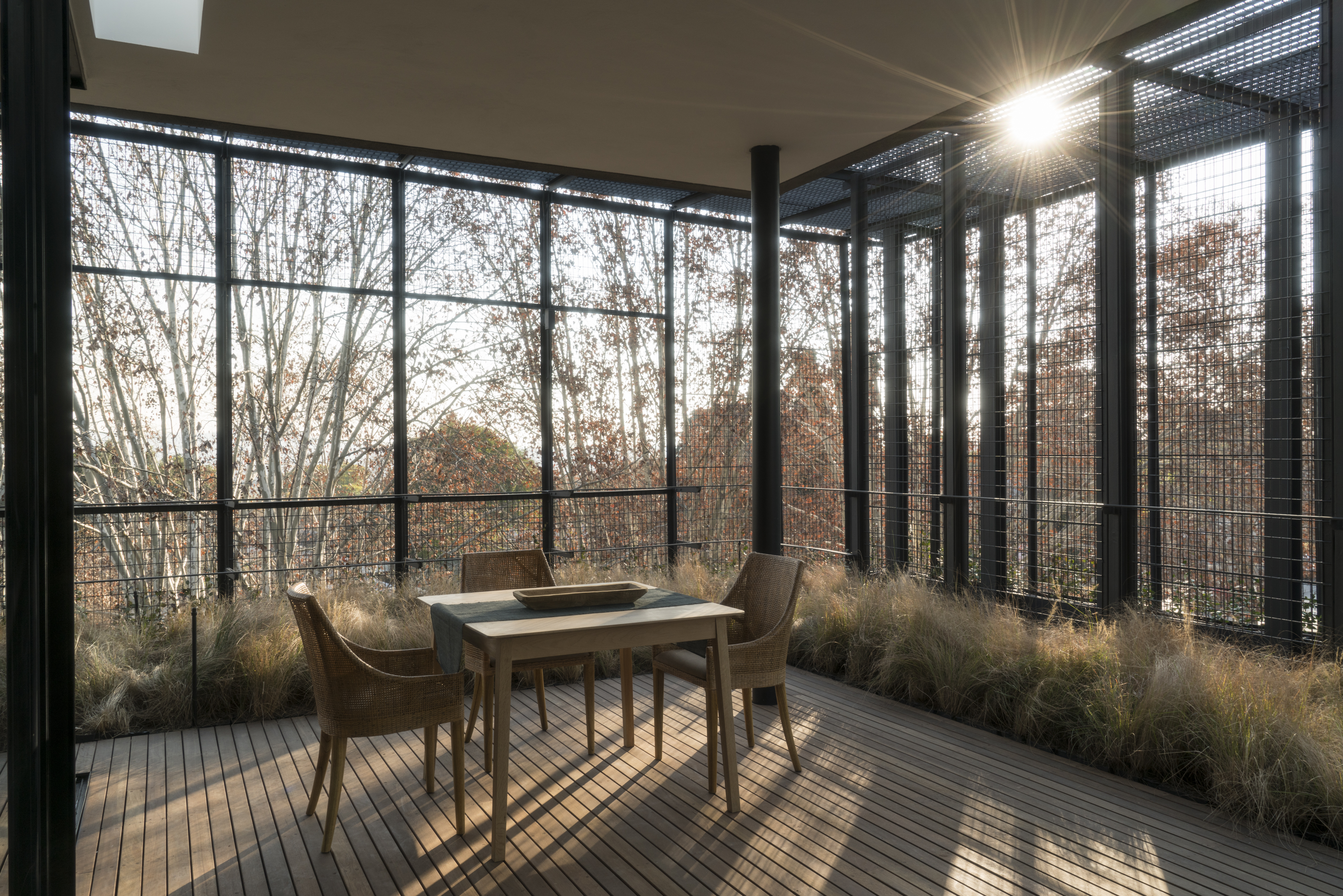
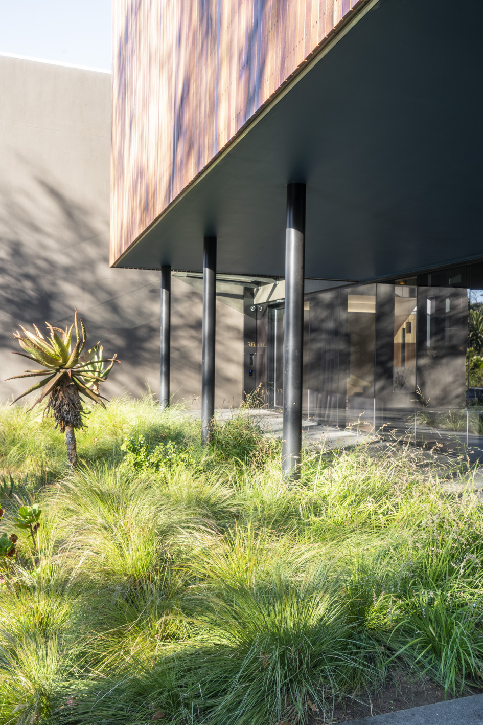
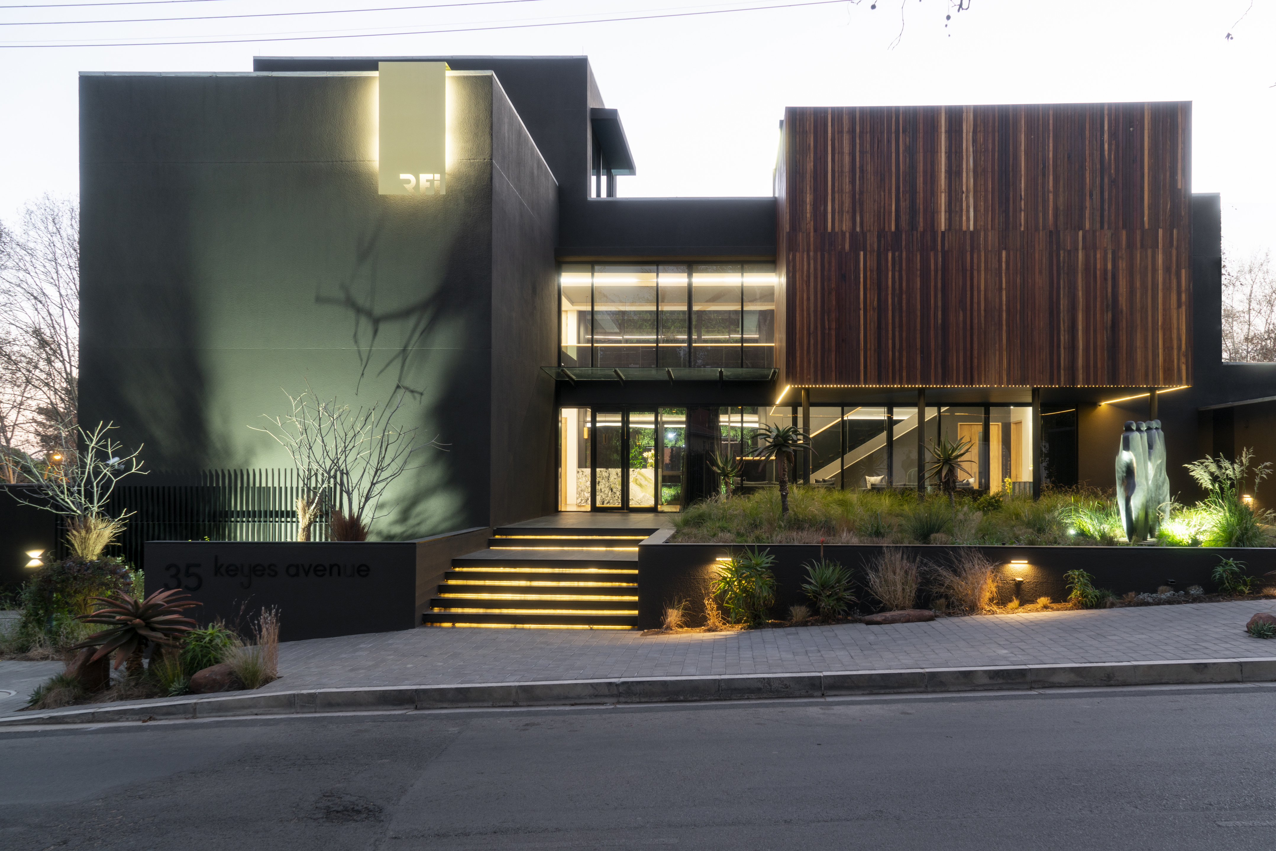
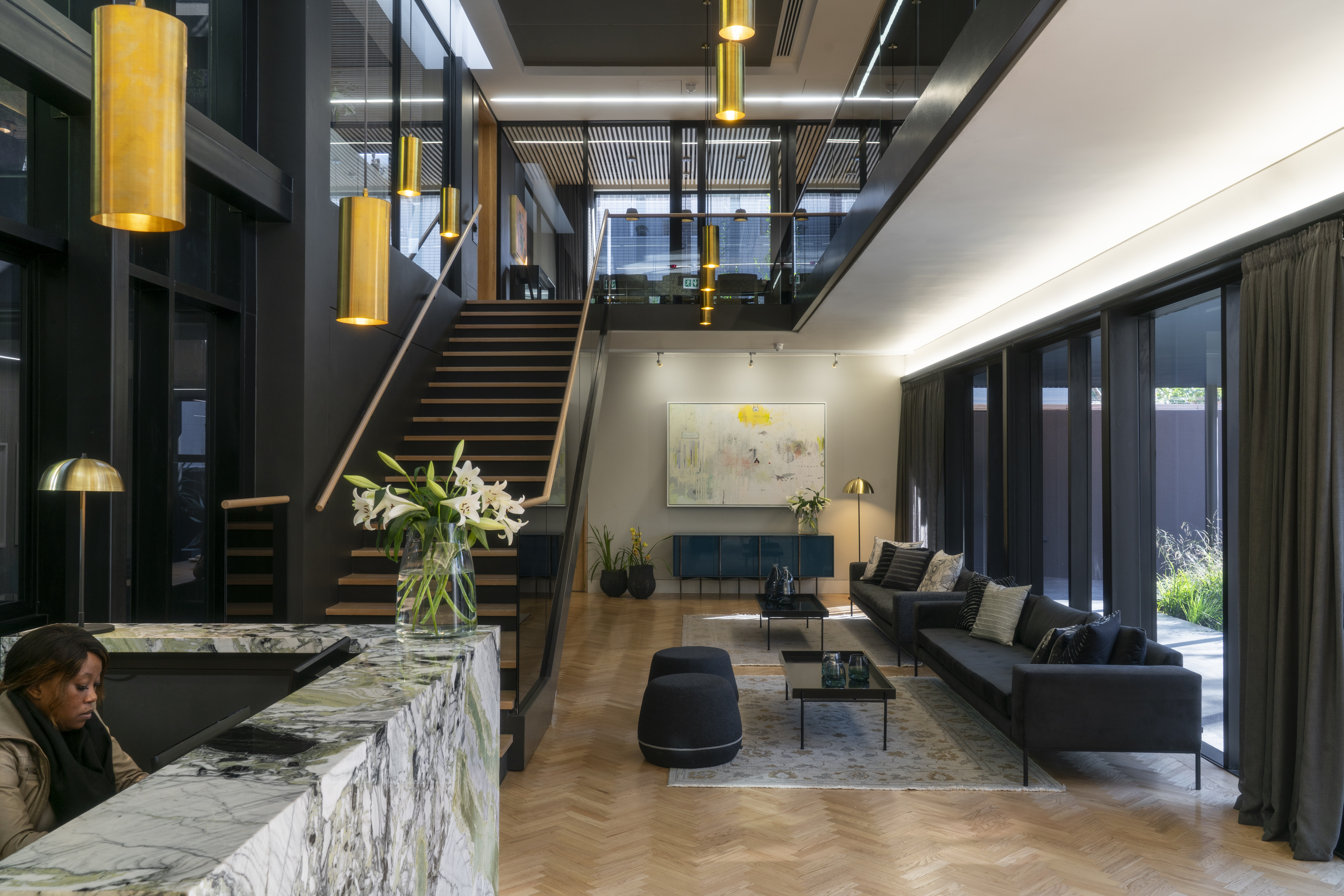
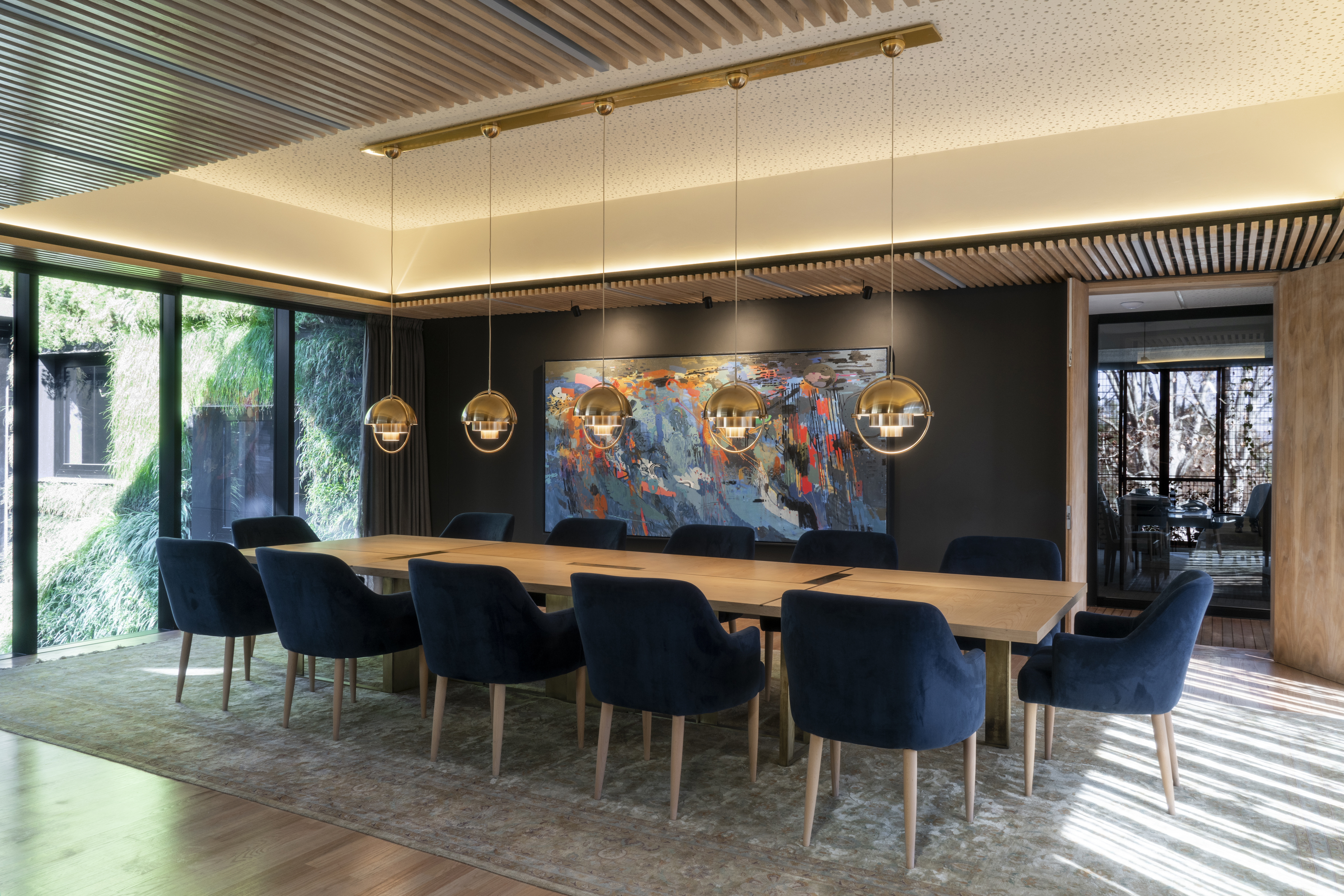
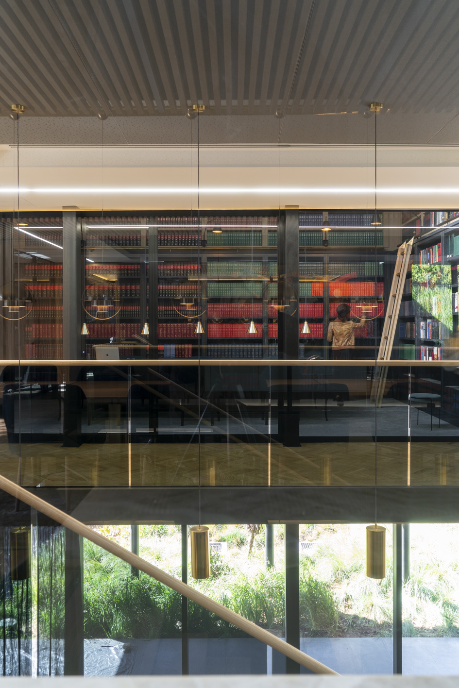
Unusually for Johannesburg, members of the public can walk in directly off the street – there are no security barriers. Instead, you enter past a garden with artwork and sculptures. Public spaces like the reception and the waiting area are on Keyes avenue, addressing the street; the boardroom, library and meeting rooms are organized around courtyards and terraces. Each room is designed specifically for its use, with a particular emphasis on sensory responses – colour, touch, acoustics, warmth, light, and views.
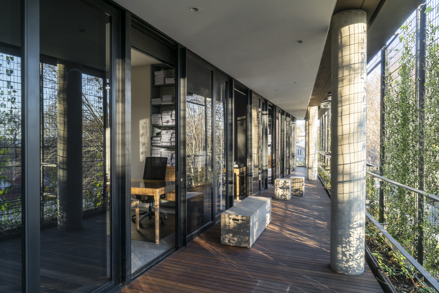
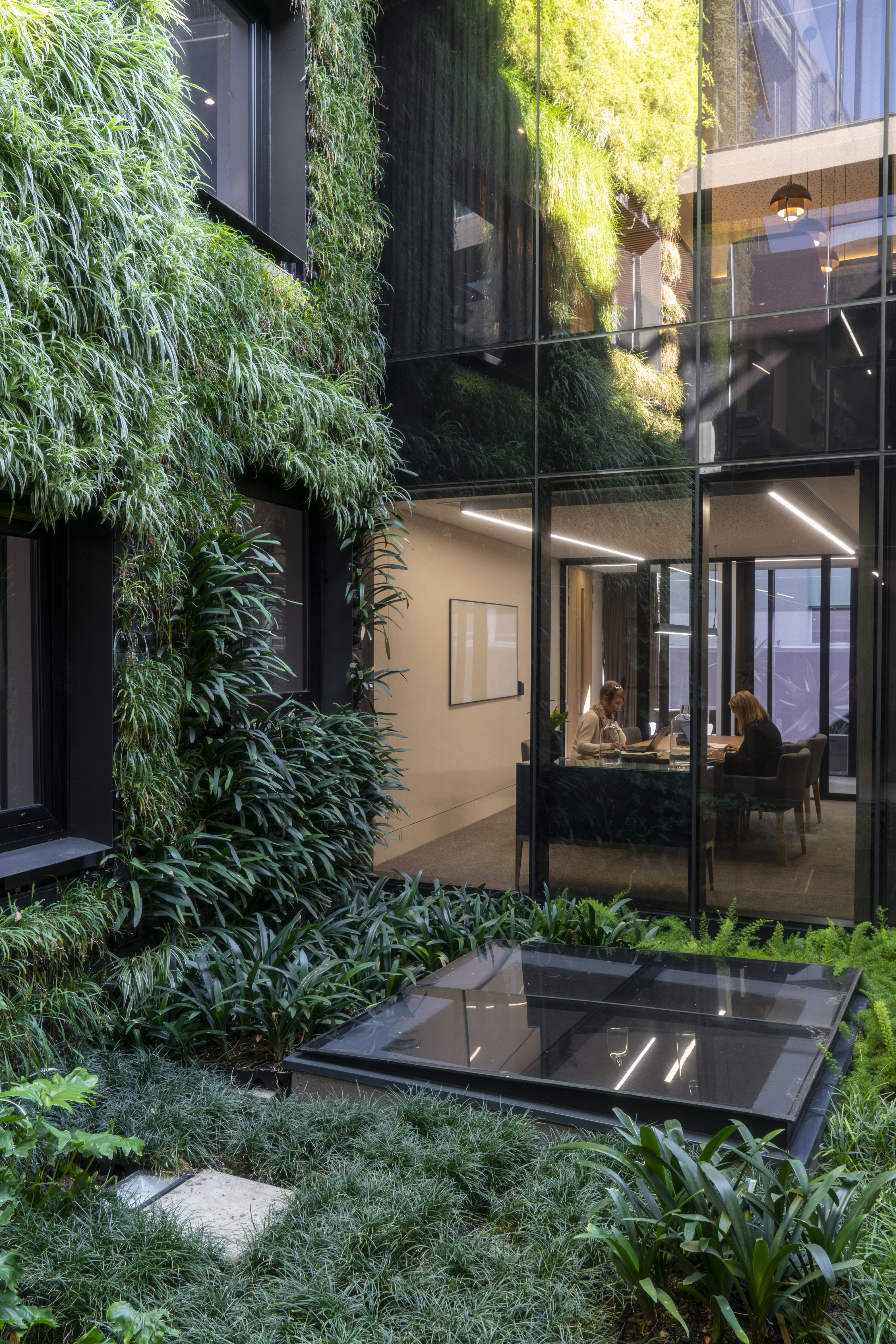
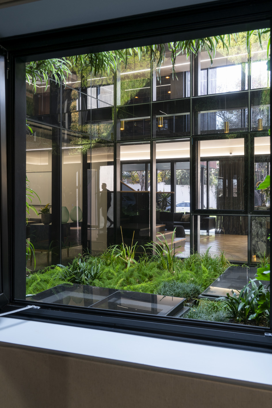
The open plan offices look into an internal planted courtyard and out towards the city, whilst the individual offices are a glass ‘box’ contained in planted ‘green cage’. There are no passages; one moves past courtyards and through informal meeting spaces, always with a different orientation and distant view of the city or near view of planting.
The idea of Johannesburg a large urban forest inspired the idea of fabricating landscapes – there are three types:
Rain water is collected and used for irrigation; high level roofs are lined with photovoltaic panels.
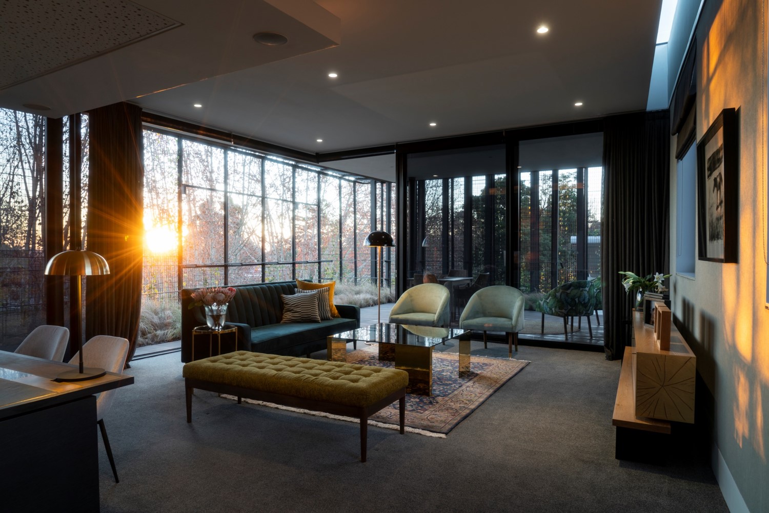
Interiors and artworks were curated by the architect with an emphasis on quality, beauty and tactility, creating an uplifting environment for staff and visitors.
From how the building is set in its urban context to how the visitor experiences the public spaces and on to the intimacy of a lawyer’s private office, people have been placed centre stage.
![]()
Our design sought to re-script the idea of ‘office’ – to transform a traditional, formal, masculine law office into a space that is uplifting, inspiring and humane. The building is designed with the users at the centre of our focus. Instead of designing a beautiful envelope with generic floor plates into which people are arranged to fit, we crafted spaces to suit and fit the people.
Unusually for Johannesburg, members of the public can walk in directly off the street – there are no security barriers. Instead, you enter past a garden with artwork and sculptures. Public spaces like the reception and the waiting area are on Keyes avenue, addressing the street; the boardroom, library and meeting rooms are organized around courtyards and terraces. Each room is designed specifically for its use, with a particular emphasis on sensory responses – colour, touch, acoustics, warmth, light, and views.
The open plan offices look into an internal planted courtyard and out towards the city, whilst the individual offices are a glass ‘box’ contained in planted ‘green cage’. There are no passages; one moves past courtyards and through informal meeting spaces, always with a different orientation and distant view of the city or near view of planting.
The idea of Johannesburg a large urban forest inspired the idea of fabricating landscapes – there are three types:
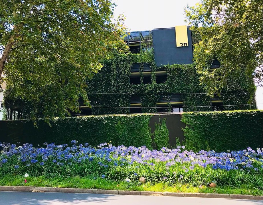
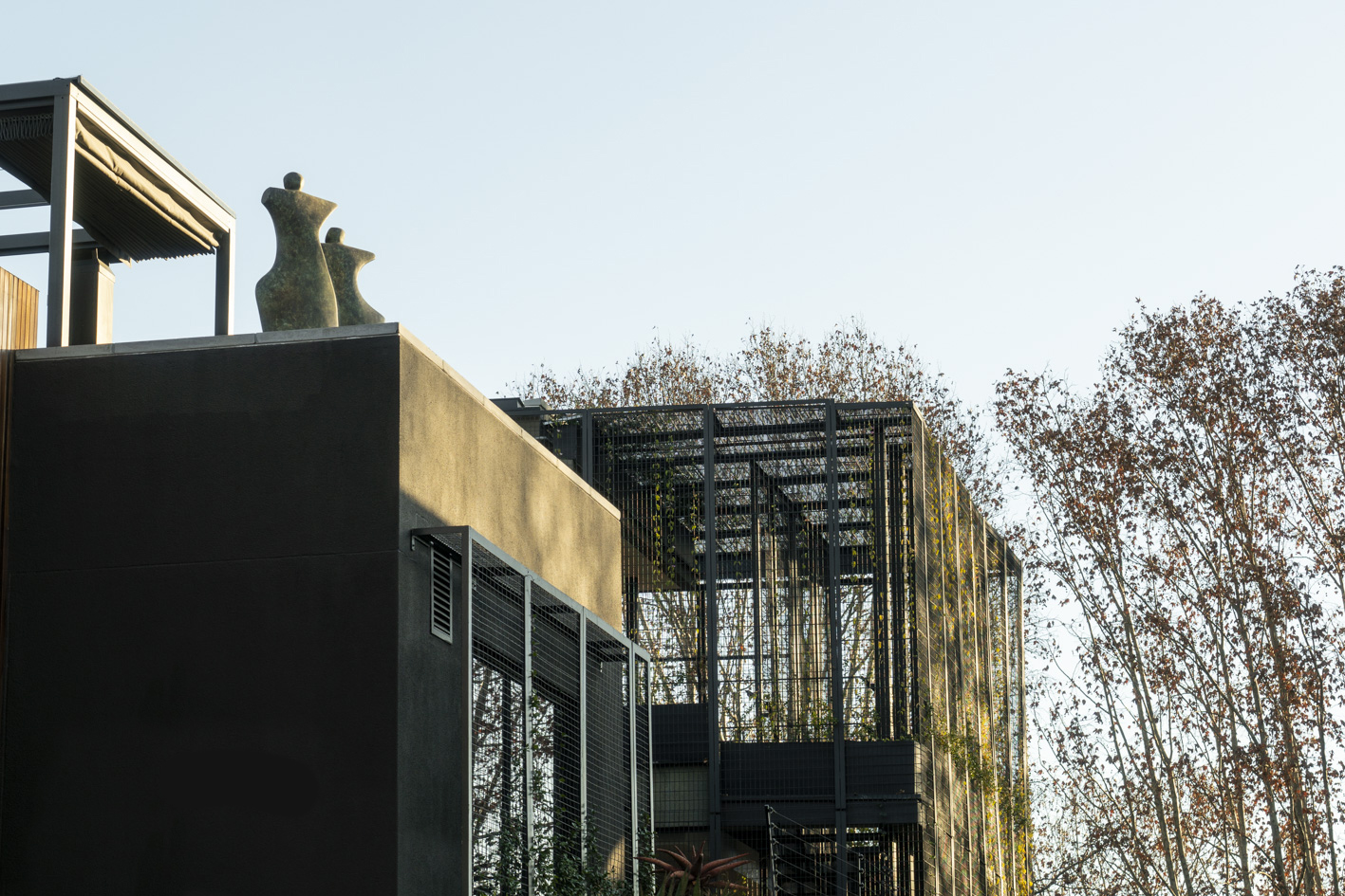
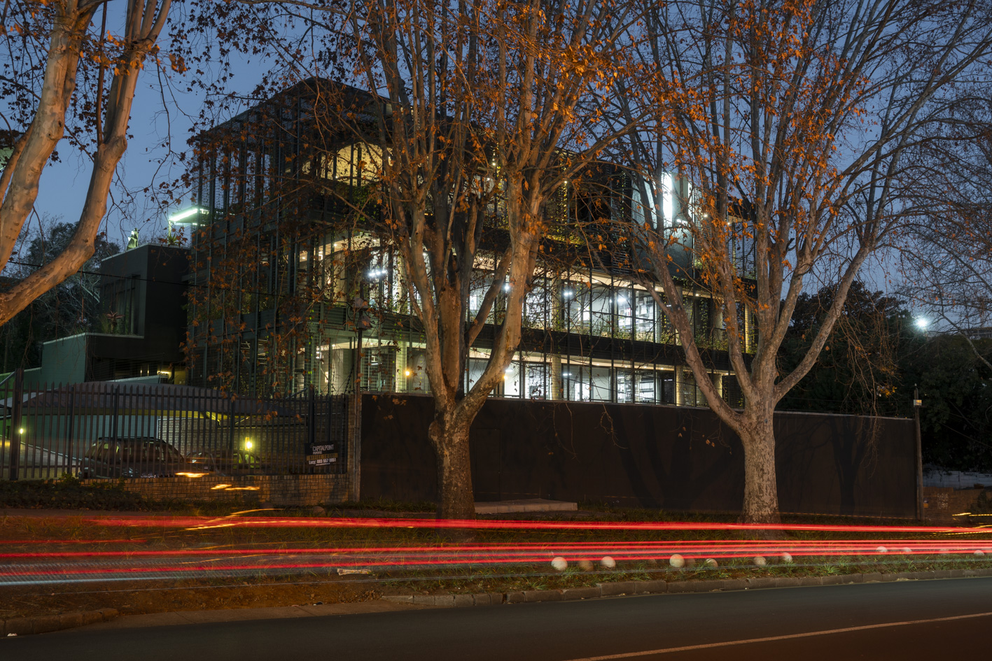
- a 3-storey planted green screen that wraps around the glass office ‘boxes’, filtering the west sun and visually screening the busy arterial road with cut-outs in the mesh that frame views of the city and of the rising and setting sun.
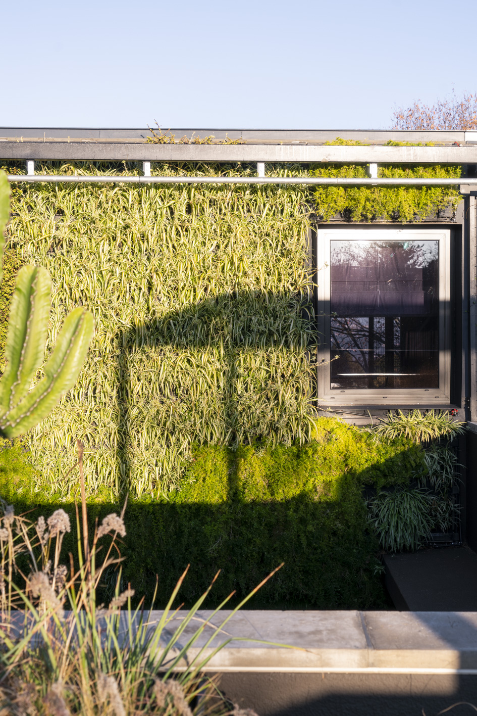
- a lush green wall and floor carpets the intensely visible central courtyard.
- a variety of roof terraces and external courtyards that are planted with indigenous veld grasses and aloes, changing colour with the seasons.
Rain water is collected and used for irrigation; high level roofs are lined with photovoltaic panels.
Interiors and artworks were curated by the architect with an emphasis on quality, beauty and tactility, creating an uplifting environment for staff and visitors.
From how the building is set in its urban context to how the visitor experiences the public spaces and on to the intimacy of a lawyer’s private office, people have been placed centre stage.
